Comparing Email Templates that Are and Aren’t Mobile Compatible
Here is an email that we sent to one of our subscriber lists a few years ago.
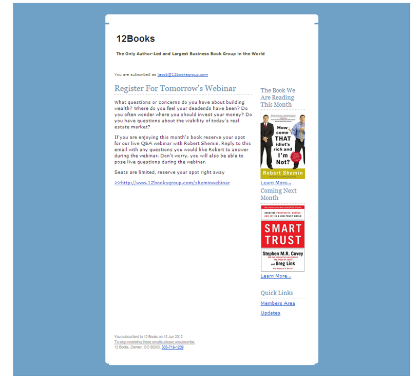
When opened on a desktop browser the email was laid out fine with a main content area and a sidebar. Here is how it looked on a desktop:
On a mobile device it has the same appearance with the same layout. Here is how it looked on a mobile device:
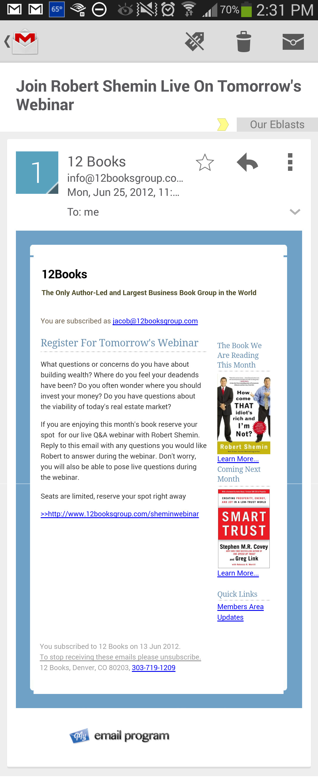
As you can see they two emails look the same and that doesn’t make for a positive experience on a mobile device. It leads to a lot of “pinching and zooming” to be able to read the content.
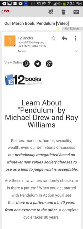
Here is another email sent more recently with one of our mobile friendly templates. Here is how it looks on a desktop browser.

Here is how the same email looks on a mobile device. Because the layout is responsive it looks great on mobile and still is build with standard HTML tables so as to not put up any red flags with the SPAM filters.